Add Responsive Table in Blogger
Hello friends, welcome to the Dream To Blog Blogger Design tutorial. Today I will show you how to make a responsive table in Blogger blog posts or pages.
Today we will create a responsive table in blogger blog post, when we are going to post about any product specification, product review, some versus content then we create table and show the information, but blogger don't have any feature like that we don't have table creating function on it, so here we create make Table in Blogger blog using code.
Step by Step Guide to Make a Responsive Table in Blogger for Beginners
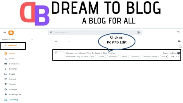
Step 1: Open blogger dashboard. Go to Blogger Pages or Posts and click on Edit for any posts or pages for which you wanted to add a table. Also you can click on New Posts or Pages in order to add a responsive table inside the new posts or pages.
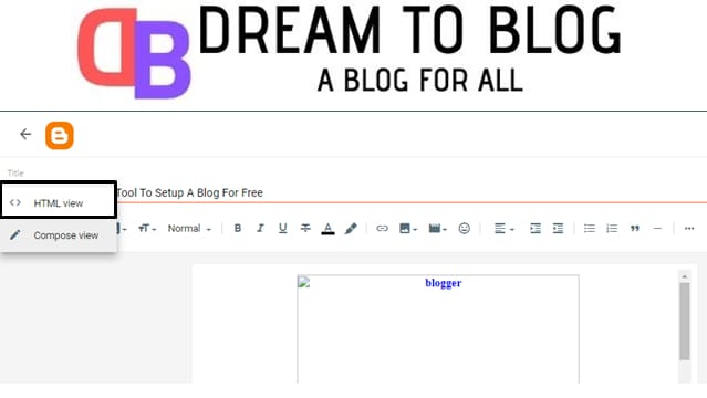
Step 2: Now click on HTML view button and to go to HTML code area to add HTML code of responsive table.
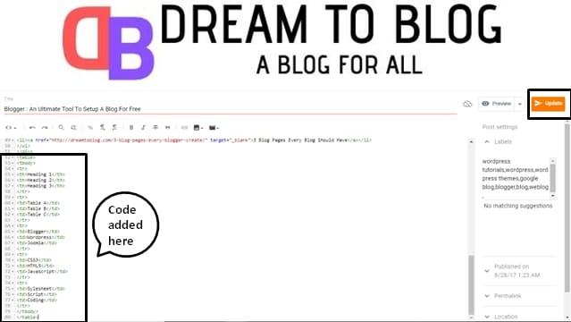
Step 3: Copy below HTML code and paste it in the code area where you want to add a table. Replace the orange colour text in the table with your text. Once done, click on Update button.
<table>
<tbody>
<tr>
<th>Heading 1</th>
<th>Heading 2</th>
<th>Heading 3</th>
</tr>
<tr>
<td>Table A</td>
<td>Table B</td>
<td>Table C</td>
</tr>
<tr>
<td>Blogger</td>
<td>Wordpress</td>
<td>Joomla</td>
</tr>
<tr>
<td>CSS3</td>
<td>HTML5</td>
<td>Javascript</td>
</tr>
<tr>
<td>Sylesheet</td>
<td>Script</td>
<td>Coding</td>
</tr>
</tbody>
</table>
Step 4: Go to blogger dashboard. Click on Theme and then click on customize.
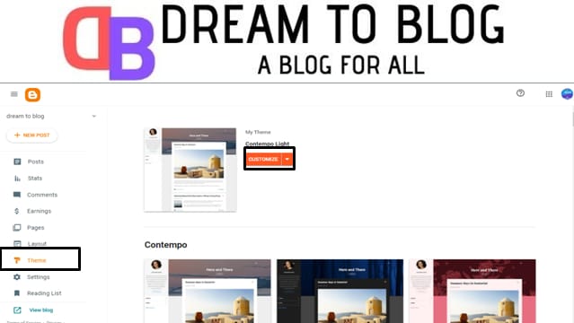
Step 5: Click on Advanced, in the drop-down menu, search for add CSS and click on it.

Step 6: Copy below CSS code and paste it in CSS code area. Click on Save.
table {
color:#333;
font-family:Helvetica,Arial,sans-serif;
width:100%;
border-spacing:1px;
border-collapse:separate;
padding:0 3px;
}
td, th {
height:30px;
transition:all .3s;
text-align:center;
width:auto;
}
th {
background:#B1B6AF;
font-weight:700;
border-radius: 5px;
}
td {
background:#FAFAFA;
}
tr:nth-child(even) td {
background:#F1F1F1;
}
tr:nth-child(odd) td {
background:#E1DDDD;
}
tr td:hover {
background:#666;
color:#FFF
}

That's All!! You are done with the responsive table. Just check your table on different devices.
Still facing any trouble, in creating a responsive table for your BlogSpot posts or pages, comment below in the comment box. We will try to reply you as soon as possible.


0 Comments
We appreciate your comment! You can either ask a question or review our blog. Thanks!!